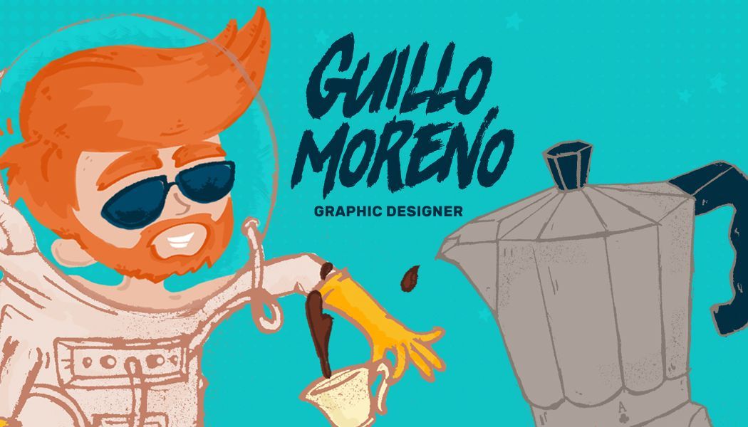
Whoever sees him can’t imagine that, buried in that slight presence, there is an ironic being, capable of disemboweling an icon. It is Guillo. He barely speaks, with his countertenor voice – I say, I who knows nothing about that. A melodic and diffuse voice; light, It could also be said. He bears a very wide smile and warm eyes under a shag of reddish hair.
In this way, this kindhearted man spends his time working on his laptop which he takes with him everywhere he goes. In this way, solicitous, he pleases, suggests or dissents without those of us who make this magazine OnCuba with him becoming aware.
It is Guillo, who designs and illustrates, who gives color and shape to our data and has made OnCuba, with its illustrations, a very specific virtual profile. You just have to take a look at the Billboard.
He graduated from the Higher Institute of Design in Havana just two years ago. His work dossier already has a few tomes with such different matters as the redesign of the identifier of the Santiago de Cuba baseball team or the identity handbook of Guanabacoa’s Niceto Pérez Agriculture and Livestock Cooperative.
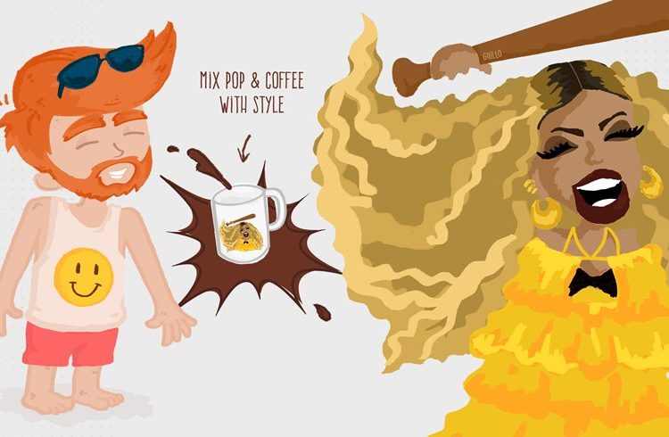
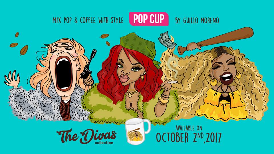
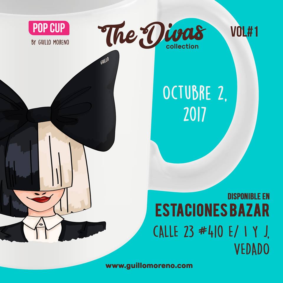
But these days Guillo is mixed up in, let’s say, major matters? A divertimento, it seems. It is the first step on a road of searches to turn his talent into an entrepreneurship. On October 2 he’s already made his first series of illustrations oriented on breakfast cups: his POP CUP that takes off with the first volume of his first collection: the Divas.
(Un)drawing
“I’m still learning, and there’s no doubt that to get to be a caricaturist I’m still missing a lot, but yes, the caricatures usually stand out for exaggerating features. My illustration, let’s call it that, while it has some caricaturing elements, is a hybrid that is still rare, because I play with iconic elements of the character, but I don’t exaggerate them at a very extravagant level. More than anything I focus on the colors.”
The fact is that these 10 divas of British pop Guillo has presented us with and that range from Adele to Madonna – the queen couldn’t be left out – appear semihisterical, semicomical, semipretty and semihorrifying. They are only the first batch of what is to come.
“In this series I give more importance to playing with the caricaturing of the character, to facilitating that an iconic look be recognized, which has marked a stage in each of those characters’ career. In this case, at a first level what I want is that: that the character be identified and to also appeal to the picaresque.”
The origin
“It occurred to me when I gave a friend a cup on his birthday with an illustration I made of Adele, whom he adores. Afterwards I said to myself: why not take a few to ceramics? Who doesn’t like having a cup of coffee with their own style?”
“We are constantly bombarded by products, by pieces of communication that not only don’t look good, but also don’t communicate well and in addition are degrading our visual culture. I believe that as a graphic designer I can help a bit in preventing this from happening. The time of change we are living and the opportunity we have must be taken advantage of.”
“The idea seemed crazy to me the minute it came to my mind, but someone I admire usually says ‘ask for the Moon so they give you Jatibonico [a small Cuban town],’ and that’s how I got a grip more than ever on that initial concept, on those positive, funny, iconic and inspiring messages which already form part of our popular culture and I said: Let’s start asking…. I that’s how it started.”
Take one home
“Having the brand, POP CUP, from which different collections can come out, I can achieve a long series of products dedicated not just to the divas and phrases from their songs, but also other classics from our pop culture…. And not just about music, but also about visual arts, cinema, television, culture in general and, of course, also about Cuba.”


